Masthead
The name of the magazine will be Topick (a play on the words 'topic' and 'pick' as in the pick of a guitar). The 'K' will by stylised such that the right leg will look like a lightning bolt. The 'T' will also my stylised, such that it's leg will resemble a lightning bolt striking in the opposite direction to the 'K'. The 'O' will resemble a vinyl record.
The lightning motif in the stylisation of the magazine masthead was chosen in reference to how a chord is 'struck' on a guitar. It is a similar idea to that of the KERRANG! logo utilised from 1983 to 1996, then re-adopted by the publication in 2021 - the typography (and indeed the word itself) is representative of the 'sound of a power chord struck by an electric guitar'.
The overall shape and form of the title also takes inspiration from the American heavy metal band Metallica, who's logo is designed such that it features prominent downward spikes protruding from the first and last letters. The downward angle of the lightning bolt-esque leftmost and rightmost letters in the title of Topick are designed to bring the consumer's attention between the bolts - they are designed to frame the talent chosen for the front pages.
| Current Kerrang! logo. Originally used from 1983 through 1996, again since 2021 |
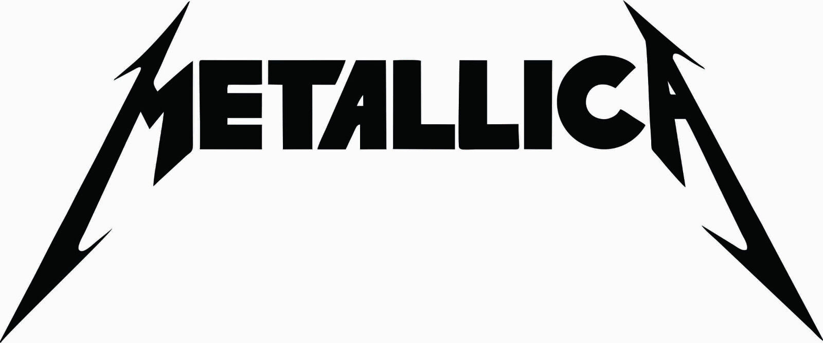 |
| Iconic Metallica logo, featuring a prominent downward swoosh on either side. |


No comments:
Post a Comment